Starr Wright USA
UI / UX / Website Design + Development

The Product
The general goal of this project was to increase the conversion rate of policy enrollment through their online application process.
A professional liability insurance company, Starr Wright USA continues to be a pioneer in the development, design, and implementation of insurance programs to meet the needs of federal employees and their families.
Client
Starr Wright USA
CEO, CMO, Senior Consultant
Live Site
Year
2018
The Research
The user of the product would be a federal employee of any level - these users would range in age from 25-55, could be either male or female, and may not be the most tech-savvy.
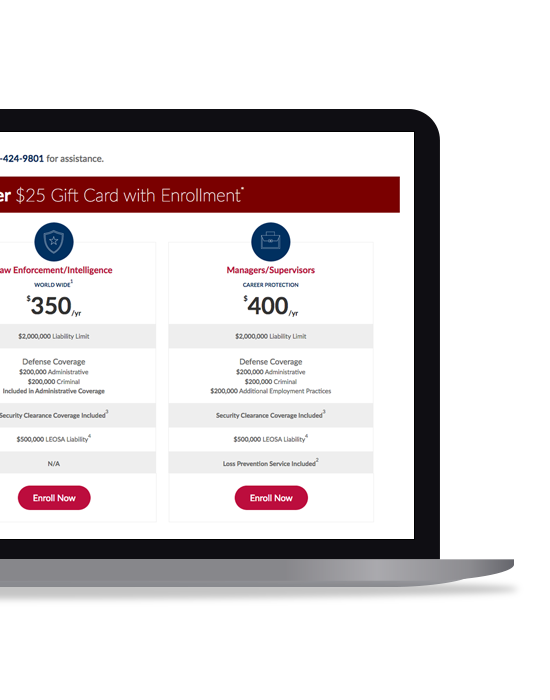
The current application process seemed overwhelmed the user. This process offered 5 different plans that were presented in paragraphs and lengthy bullet points, which made it difficult for the user to compare. Once the user selected a plan, they were offered additional add-on coverages on a separate page, and they into a long-winded and drawn out checkout process that consisted of form fields split over 5 pages with no progress bar indicating where the user was in the process and if there was an end in site.
The Design
This application-process was designed to streamline the flow, and walk to user through the process in quick and comfortable fashion. Keeping the design clean, and giving the user visibility on where they were within the simple 3-step process, we kept the user focused on making it to the finish line.
With insurance (any type for that matter) not being the most exciting purchase, we wanted to make this process as easy and efficient for the user. We limited the plans down to 3 for a good, better, best approach, and used quick, simple wording and bullets to describe each plan. By using the card-style layout, we were able to horizontally align the content for each plan, making it easy for the user to compare each plan to one another.
Finally, condensing the previous enrollment process into 3 simplified pages, the user was able to efficiently move through and complete the process. And, by providing a progress bar at the plan selection stage, the user was informed of what the process would take to complete, leaving no surprises.
The Analysis
The focus on cleaning up the user interface along with streamlining the user experience to improve the user's flow through the process allowed for a higher conversion rate and a lower bounce rate, ultimately resulting more policy enrollments.
After testing and analyzing, here are a few refinements that were made or suggested:
- On the Enrollment page (Step 2), we made the plan card sticky and scroll with the page, making the plan, details and pricing always visible to the user.
- An Exit lightbox was added that allowed the user to select 1 of 4 options on why they were leaving.
- Different verbiage and creative were used on the Enrollment promotional banner to see what performed better.