Lantex, USA
UI / UX / Development
The Product
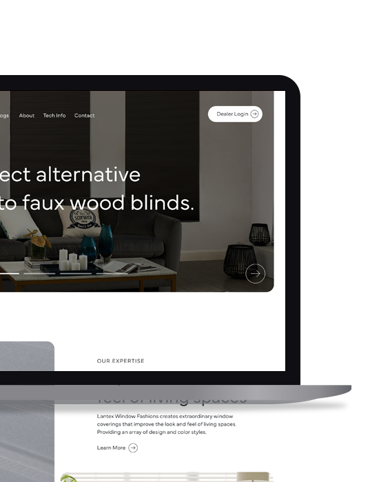
This project with Lantex consisted of a customer-facing marketing website along with a dealer portal that offered online ordering. Lantex wanted to create a marketing website to showcase the breathe of their product line as well as the options, colors and variations available for each product line. In addition to the marketing website, Lantex was looking to provide their distributors an online solution to place orders via a web application/ecommerce solution.
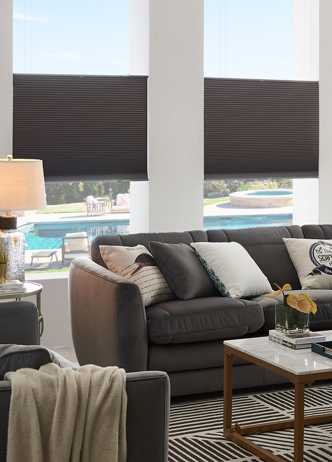
Lantex Window Fashions creates extraordinary window coverings that improve the look and feel of living spaces. Providing an array of design and color styles. They have built our standard of excellence upon continuously improving every area of our business. Lantex strives for innovative products created under safe and sustainable production practices.
Client
Lantex, USA
CEO, Marketing Manager & Marketing Coordinator
Live Site
Coming soon...
Year
2021
The Research
Lantex, USA doesn't sell product DTC, but rather uses a network of distributors and dealers, usually in the form of specialty window covering retailers. Initially the scope of the project was to create only the dealer portal, but after diving into the project and getting insight from internal staff as well as their distribution network, it became clear that a marketing website would help the dealers showcase the Lantex product line to their customer, and provide visibility into all the different options that are available when choosing a custom made-to-order window covering. Along with the marketing website, the dealers were looking for a quick and easy online solution to place orders with Lantex - with all the different colors, options, and variations, we needed to simplify the current paper-based ordering system.
The Design
We completely redesigned the marketing website so the user would feel what the Lantex brand stands for - standard of excellence, innovated products, and premium materials, with a focus on customer service. We created multiple ways for the user to browse the different product lines via three main categories - products, systems, and styles, and from here, there were a list of sub-categories for each, followed by a category page that would list the appropriate products. We separated each product as it's own page and listed the available options, variants, and colors that were available via an icon or color swatch and the associated name.
When it came to the dealer portal, we wanted to make this as fast and efficient for the dealer as possible - as they most likely new exactly what they wanted to order for their customer. Creating an order would begin by select the product from the list of 6, and then the dealer would be presented with all the customization options available for that product. After added a product to an order, the user would be presented with two options - 1. Review Order, or 2. Add Another Product. We simplified the user flow by limited the number of screens and clicks needed to complete the order, saving the user time.
The Analysis
Coming soon...