Johnson Fitness & Wellness
Product Owner / UI / UX / Development

The Product
Looking to increase ecommerce sales, along with increasing sales opportunities into the 100+ retail stores through the United States - to become the go-to retailer, both in-store and online, for premium home fitness equipment.
At Johnson Fitness & Wellness, they provide the very best guided experience at retail showrooms nationwide, staffed by their passionate fitness experts, selling premium, club-quality home fitness equipment and wellness products.
Client
Johnson Fitness & Wellness
CEO, CMO, CSO, Senior Web Manager
Live Site
Year
2022
The Challenges
- Improve Checkout Flow UX/UI - Research shows that users drop, as there is limited insight into shipping and delivery options, costs, and estimated time frame.
- Increase AOV - Hard good purchase are a considered purchase, that usually only include a single product.
- Increase users time on site - Analytics show the majority of users are shopping product price and leaving - very low time on page, page scroll percentage, and total page views.

Challenge
Provide user with shipping options per product, rather than per order, as well as transparency regarding shipping options, cost, and expected delivery date.
Research
During discovery, we realized shipping options and pricing are not available until a user lands in checkout and enters a state value in the shipping step. Once a user achieves this, the shipping method select dropdown would populate with shipping options for the users entire order, rather than per product - causing friction for the user and loss of shipping revenue to the company. From customer chats, contact us form inquiries, and customer notes added post-purchase, it became evident that users would become frustrated that they couldn't easily locate these details and expect more transparency.
User Flow
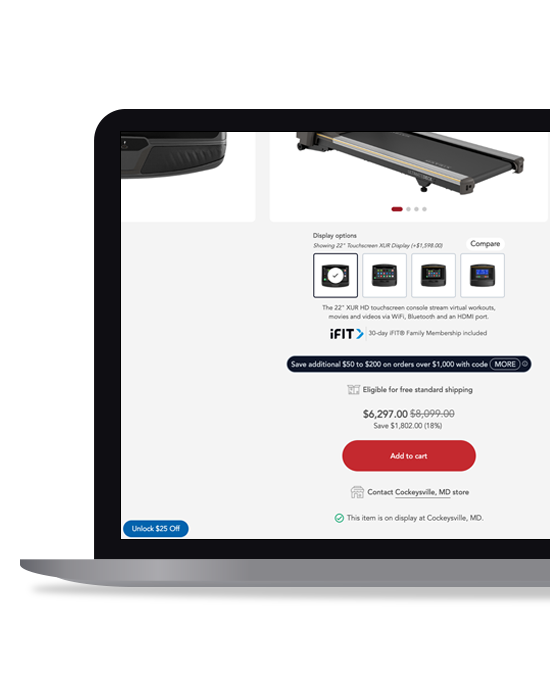
Separating out shipping options to the product level gave us the ability to provide the users this information on individual products pages, allowing the user to see and select any of the available shipping options as well as pricing for that specific product, prior to adding the product to their cart.
Design & Development
Below is the design and functioning prototype we came up with for the updated checkout UX/UI.
First, we started by moving the shipping/delivery/pickup options, along with pricing to the product page, prior to adding the product to cart. Since we are already using geolocation to determine the user's closest store location, we can piggy back on that and to determine user's zipcode, allowing us to skip the need for the user to give us their location information to determine shipping costs - we also display the zipcode above the shipping options and allow the user to update this, in the event our auto-dectection wasn't correctly determined. In the upper left, we provide a link that allows the user to review what each shipping option details and estimated shipping times (this was the best we could get to due to constraints beyond our control).
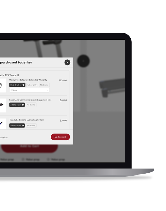
Once a hard good is added to the cart, the add-on and accessory lightbox will fire, giving the user options for product and home protection items related to their product. From there, the shopping cart will open and provide the user an overview of the products and shipping options for each product in their cart.
In this users journey scenario, the user opts to have the treadmill delivered and setup in their home, while they'd like to pickup the treadmill silicon lubricant. We've accommodated for this - Steps 1 & 2 of the checkout process are relevant for the "in-store pickup" product, while Step 3 will handle the delivery information.
Result
N/A... WOP. Still in design and development.
Initially Phase 1 launched (live) with new shopping cart UI/UX, which includes:
- Larger product thumbnails (users are often using the shopping cart to save items during their site visit, this allows them to visually identify their products easier)
- Larger quantity control buttons (allows users to more easily update on mobile)
- Added Estimated Tax and Estimated Shipping Cost (provides the user with total price transparency without having to enter checkout/leave current page)
- Added a block that contains value props under the order overview on the right column (to ensure our website is safe and our brand is reputable)

Challenge
We are looking to increase AOV on orders with hard good (treadmills, ellipticals, exercise bikes, home gyms, etc.) are a considered purchase by introducing home and product protection items - equipment mats, product maintenance items, and extended warranties.
Research
Reviewing sales data, we realized that certain stores - those with sales consultants that bought into the idea of the "protection products" and presented these options to customer - seemed to do really well adding these products to orders.
User Flow
We initially implemented a solution that offered these items on the hard good products - we had them as checkbox selections under the main product images, and above the price and "Add to cart" CTA. Through session replay analysis, we discovered that users may be doing one of two things - 1. Skipping/missing these add-on products completely. 2. Recognizing these options, interacting with them, but failing to proceed to add to cart. (similar to what you see in the screen to the right of the "Current UX Flow". Not achieving the lift we were looking for, back to the drawing board I went, keeping the session replay analysis in mind. Well, what if we moved the protection add-on products after the "Add to cart" button? Will that make a difference? Seems like a more natural place to offer these items.
Design & Development
During the design phase, we kicked around the idea on exactly where to add the lightbox - in the cart, in checkout, etc. - and ultimately decided on creating a lightbox between the "Add to cart" action and the shopping cart opening. We believed by isolating these items in a lightbox, it would provide the "Oh hey, with the investment you're making, let's protect it as well as our home..." feeling. We didn't want the user to overlook these products, but also needed the experience to be super intuitive and smooth so the user wasn't confused or overwhelmed and forgot the task at hand. Rather than using checkboxes, we opted for radio button that included text to clearly explain the option (along with a select dropdown for warranty years). Note: In the design below, you'll note that the options are auto-selected to include these items, although we did decide to default these selection to "No thanks" in production.


