Homesite Mortgage
UI / UX / Website Design + Development

The Product
The overall goal of this project was to generate more qualified leads to the Homesite Mortgage banker team - whether converting a user that is looking for more information on home loans in general, are looking to get pre-approved, or are rate shopping.
As a regional lender Homesite Mortgage are large enough to offer a wide array of financing solutions, yet small enough to keep their attention to detail and your overall customer experience at the highest levels.
Client
Homesite Mortgage
President, General Manager, Senior Consultant
Live Site
Year
2020
The Research
The home loans industry is a highly competitive market with some large players, making it extremely tough for the little guys to rank organically. Due to their size, Homesite Mortgage's website traffic is highly attributed to their Google AdWords spend, along with some social media marketing - using specific and tailored keywords, finding a niche within the market.
After our analysis, we determined that the website user-base consists of 3 primary customers - refinance, first time home buyers, and forever home buyers. Without having the ability to offer an instant-online pre-approval process, the forms were a total of 6 steps with a few of the steps in the middle of the pack being quite lengthy, user's would drop off mid-go. And, with the user's contact information (name, email, phone) not required until the last step, those users were simply lost.
The Design
A simplified navigation that focused on the company's core competencies that steered the user to educational information, but also quickly introduced easy ways for the user to contact Homesite Mortgage. Creating customer journeys by identifying their 3 primary customers - refinance, first time home buyers, and forever home buyers - allowed us to build custom, streamlined user flows for each, removing friction through the pre-qualification process.
Here are a few of the user personas we developed:
The Rate Shopper. This user has either decided to purchase a home or refinance their current home - they are at the end of the funnel. In this case, the user is looking for the best rate available. For this user, they are coming in 1 of 2 ways. The first, via a Google AdWords campaign. In this case, we create a landing page that show's the current rates on 30-yr and 15-yrs loans (along with 3-competitor's rates) with "Get your personalized quote in 30 seconds" verbiage and simple form on the right (all above the fold on desktop). The second, Google's 3-pack (or local business listing), in which case the user would land on the homepage. This user would be introduced to Homesite Mortgage above the fold, followed by Homesite Mortgage's rates along with 3 competitor's rates, with a CTA that took the user to a Rate Quote form to fill out.
"How Much Can I" Borrower. This user has done their research and has decided they will either be purchasing a home or refinancing in the near future and would like to get a gauge on what they can afford. These users will find themselves on a specific Loan Approval landing page that quickly introduces Homesite Mortgage, and gets right into it with a form - either allowing them to select "purchase" or "refinance" approval, or starting within the purchase-specific or refi-specific form, depending on the what the user searched Google for. Each form included a progress indicator and estimated time of completion. For those users not coming from a campaign, they can easily get started by selecting "home purchase" or "refinance" in the main navigation.
The Gatherer. This user is just getting their feet wet, at the top of the funnel, just gathering information. They are most likely going to end up on the homepage and navigate from there. Our goal here was to provide this user with an introduction to Homesite Mortgage, show them they are competitive in terms of rates, show our credibility and highlight our customer experience, and finally provide a wealth educational information.
The Analysis
Focusing on an improved design that decluttered the page, allowed users to digest content easily - this increased the average session duration per user. Also, with cleaning up the the user flow, and quickly direct the user into a simpified multi-step contact form, we were able to increase conversion rates across the board, ultimately providing more quality leads for the lending team.
A few of the refinements that were made along the way include:
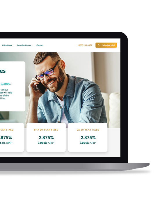
- The rates table was adjusted to have the Rate as the focal point for both 15-yr and 30-yr loans, and the APR listed underneath the rate in smaller, less prominent text - making the table easier to digest and compare rates.
- On the rates page, we initially had a card style layout above the fold for 15-yr, 30-yr, FHA and VA rates, which was replaced with the rates table on the homepage, with the intention of being vague for the purpose of initiating a user to contact Homesite Mortgage.
- Contact link was removed from the main navigation, as we were looking to push users to call or schedule an appointment - which required a bit more of a commitment on the user-end, but led to more qualified, serious inquiries.
- Caliber Home Loans was replaced with Rocket Mortgage - a more recognized name in the home loans industry - in the competitor rates table on the home page and Rates page.
Unfortunately, immediately after launch, Homesite Mortgage moved forward with a full-service agency.