AAA Club Alliance
UI / UX / Product Design

The Product
Update the UI/UX for a variety of legacy auto, travel tour, and landing pages for AAA Club Alliance.
Problem
Cluttered, overwhelming content. Not easily scannable. Can't find the information I need.
Business Goal
Convert users from "A" (landing page) to "B" (checkout process) segment of the sales funnel
Constraints
- No access to update final stages/steps of checkout
- Product designers will not be designing all pages
Client
AAA Club Alliance
Product Manager, Sr. Digital Marketing Manager, CMO
Live Site
N/A
Year
2022
The Research
"The website feels like an outdated print travel brochure from the 90's." "I need someone to come to my home and install a new car battery... Where do I find that service? Let's see where this takes me."
Users
- Too much content
- Hard to digest
- Not easily scannable
- Can't find what they are looking for
Business
- Convert to second stage of the sales funnel
- Focus on primary CTA
- Current LP layout is too rigid
- More dynamic/assorted templates
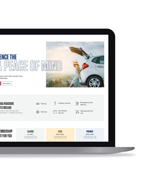
The Design
- Moved the selling proposition and call-to-action above the fold
- Removed any secondary goal, if possible
- Made the hero image more emotional and relatable to the page
- Worked with the UX Copywriter to trim and format the content into simplified, digestible bullets
- Created two versions for A-B testing and analysis
The Analysis
After user testing, making adjustments, creating final designs, and optimizing again...
- Development was provided with wireframes to create multiple templates
- Business line owners (Auto, Insurance, Travel) would utilize these when creating new product and landing pages
- Templates would have character counts for headers, paragraphs, and bulleted text, along with imagery suggestions
Internal turnover prevented any result analysis, as the project was paused prior to development.