Transformative UX Redesign
Enhancing product details pages to boost user engagement and conversion rates while simplifying cart UI for seamless purchases
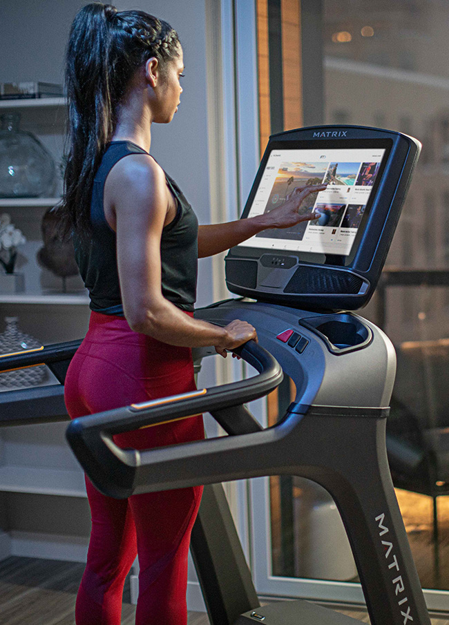
The Product
Improve UX from product description pages and shopping cart.
User Problem(s)
- Limited product details, including product features and specifications
- Tough to compare products and product options
- Shipping, return, and inventory details not visible
Business Goal
- Enhance user engagement
- Increase average order value
- Reduce checkout abandonment
Constraints
- Updating checkout page not in this phase of the project scope
- Internal systems do not allow for est. shipping and delivery times
Results
- 36% increase in PDP page view to add to cart conversion
- 28% increase in PDP cart view to enter checkout
- 67% increase in “add-on” product sales
- 19% increase in AOV
Client
Johnson Fitness & Wellness
CEO, CMO, Ecommerce Director
Live Site
Year
2023
The Research
Designing elegant and informative product details pages that removed barriers to boost user engagement and streamlined the user experience.
With over 100 retail showrooms throughout the United States, Johnson Fitness & Wellness is committed to providing it’s customers with the best selection of club-quality home fitness and wellness products, while also providing commercial fitness solutions.
During the post-pandemic era when home fitness equipment sales took a rapid decline due to the re-opening of gyms, I worked with the ecommerce and development teams as project manager, product designer, and lead front-end developer.
My Role
As the sole project manager, designer, and front-end developer on this project, I wore many hats - from digesting a UX audit, determining the project scope and researching the current digital experience to wireframes, prototypes, and front-end development.
I determined the project’s goals as well as constraints via meetings with stakeholders, while understanding the current friction points from the users’ perspective by utilizing user analytics data and studying session replay to understand the users’ digital journey.
I designed components and prototypes to provide a clear vision backed by user data, design principles, and ecommerce UX best practices via Baymard Institute. This helped illustration a our ideas, prompted creative discussions, and gain alignment across design decisions.
Upon design approval, I worked with the development team to make this vision come to life by:
- Developing the component templates of the product description with documentation on how each block can and should be used.
- Developing the front-end of dynamic components within the product description page along with the shopping cart.
The Design
Designing polished product descriptions with relevant content that would entice further user engagement.
The product descriptions were broken down into 3 main sections:
- Product features
- Product specifications
- Product reviews
Within each of the main sections above, we designed a series of templated components that could be used depending on the product’s content. This product description design system has provided a great backbone and starting point for any product, although new component have been added and the system continues to evolve to fit the content needs presented by the large product assortment.
Removing friction by providing transparency early in the user journey to eliminate cart and checkout abandonment.
Several updates were made to the product description page template to help reduce customer frustration by providing useful information in strategic locations throughout the user flow.
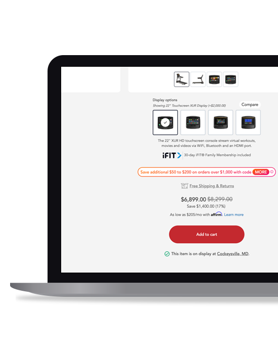
- Finalized financing partnership with estimated monthly cost displayed with link to approval
- Estimated shipping dates with link to shipping, delivery, and return details
- Local inventory details (in-stock and on display) with link to local store information
- Add-on protection items (warranties, preventative maintenance, and mats) offered
- Promotional messaging with link to details
- Estimated shipping cost based on local zip with ability to update
- Promotional codes and coupon field within cart, rather than checkout page
- Shop with confidence messaging added within shopping cart
Creating and working within a design system
We created a list of products from a variety of modalities (treadmills, home gyms, dumbbells, etc) as well as different categories (billiards tables, massage chairs, massage guns, etc) to dissect the current product descriptions to come up with common content main sections.
We then broke these main sections down into subsections. And by reviewing each product’s content and media available to us, we structured the data and designed content block templates that could be uses across each product providing a cohesive and consistent design across our catalog.
Addressing UX shortfalls found during our ecommerce UX audit to improve user flow and eliminate user frustration.
Working with our UX researcher at the Baymard Institute, we performed a UX Audit to determine where we were falling sort in terms of user expectations. At audit completion, we were presented with a 100 page document that addressed our strengths and weaknesses in term of the website’s current state of UX compared to ecommerce industry leaders across a variety of industries that sell similar products and share common business practices.
After digesting audit, we created a list of projects by priority - our highest priorities being the low-hanging fruit - items that would give us the most impact with a minimal amount of time and resources. Find the most impactful “low-hanging fruit” that were addressed in the bulleted list above.
The Analysis
As the product page is the centerpiece in a users’ purchasing decision, users being at different stages of the purchasing funnel, and the diversity of products within our catalog - After several iterations, discussions and reviews, we came up with a standard layout design that could be manipulated and would allow the user to seamlessly move through the page with a sense of clarity, while prompting the user to engage with the page.
- Product summary with 3 value props, along with photo carousel above the fold
- Additional options, pre- and post-purchasing details, add to cart CTA below the fold
- Accessible single-page navigation guides the user through the page
- Product detail blocks contain relevant imagery compact sentences and bullets to make content easily scannable/digestible
Takeaways
Working with a team of designers, developers, and merchandisers
Due to the size and scope of this project, this was so much a team effort.
For the ecommerce merchandiser, I created documentation on how to add products to the website, guidelines around the template systems - how it worked and when to use what block, as well as the template files themselves.
I provided the product designer with the Figma library of interchangeable product description components, along with guidelines on how to create new components.
I worked directly with the back-end development team through meetings, emails, and work sessions, providing designs, prototypes, front-end development and detailed documentation on how new components for both the product description page and shopping cart should come to life.
Since our initial launch and data analysis, adjustments have been made to several components to improve user visibility and engagement, and ultimately increase conversions. We’ll continue to work with the analytics team to see where improvement can be made.